Verizon Security Dashboard UI
Client: Verizon
Project: Security Dashboard
My Role: UI Design Lead
Led the visual design direction in close collaboration with Verizon’s security team, ensuring the dashboard felt native to the app while introducing a distinct identity. I helped define the system of color, typography, spacing, and motion, establishing a scalable design language that enhanced usability and trust.
The Problem
Verizon’s consumer-facing security app (Digital Secure) had a poor reputation: users complained about forced installs, confusing flows, and lack of actionable insights.
The consumer experience lacked clarity and trust-building features.
The Design
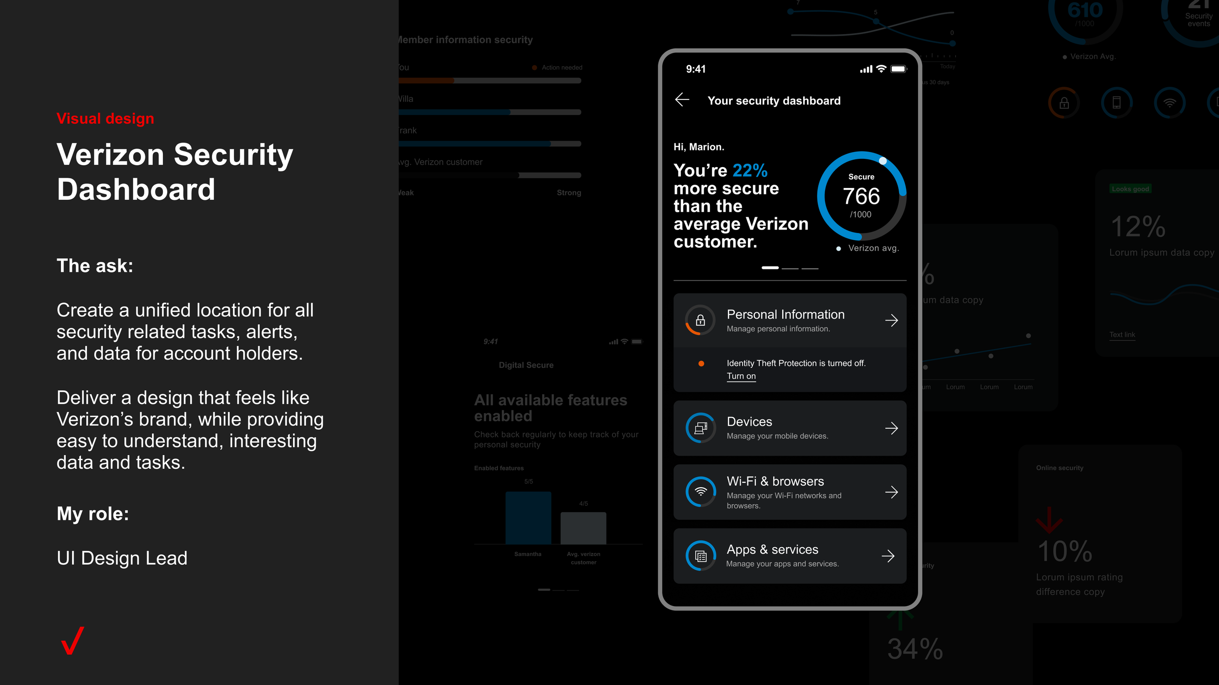
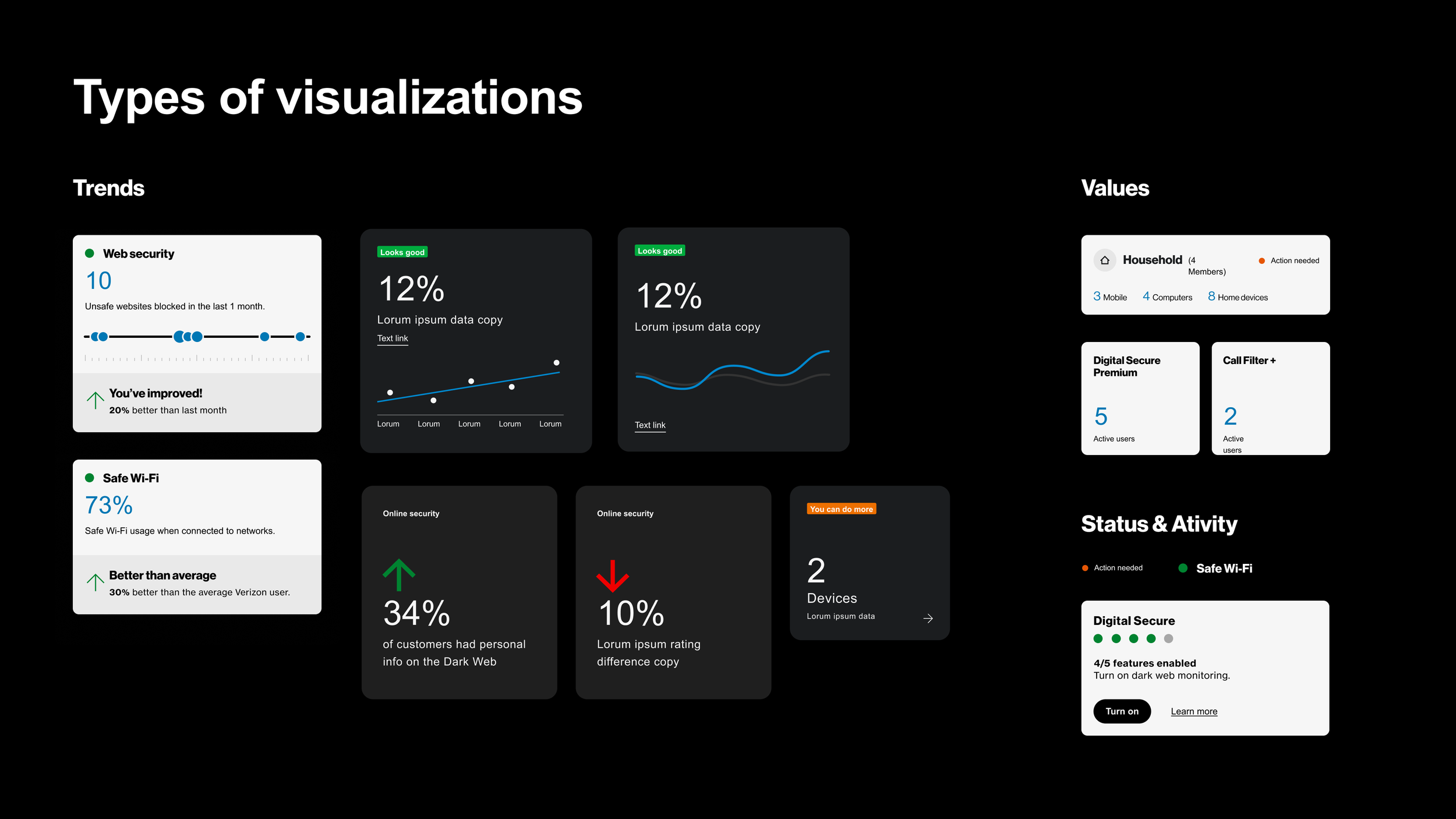
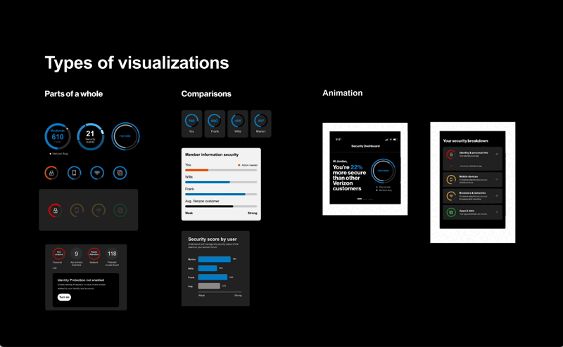
Simplification: Mapped enterprise risk/scoring models into digestible visuals, focusing on priority actions rather than overwhelming data.
Information hierarchy:Designed modular dashboard components that surface only the most important alerts, with deeper drill-downs for advanced users.
The Impact
User-Centered Reframe - Shifted the app’s perception from intrusive to helpful, giving users clarity and control over their device security.
Scalable Design System - Established modular components that can evolve with new security features, reducing future design and dev overhead.